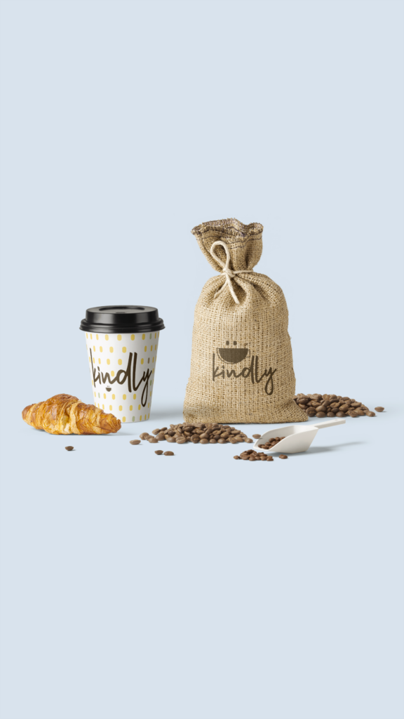
Kindly, an eco-friendly and sustainable coffee brand was brought to my attention by the creators over at The Brief Collective (TBC). Normally, TBC focuses on hypothetical scenarios to help designers expand their branding skills while also offering expert feedback.
This brief, however, happens to be a real business owned by Sarah Wingo. I figured why not take a crack at it and enter in my design to possibly be chosen to help such a wonderful company build their brand.
Without further ado, let’s get into the nitty gritty of what I came up with.
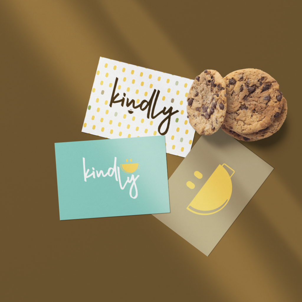
When it comes to branding, it’s important to build a logo suite instead of just one logo design. These different styles can be used in whatever scenario you and your business may venture into and will enhance overall brand recognition and experience.
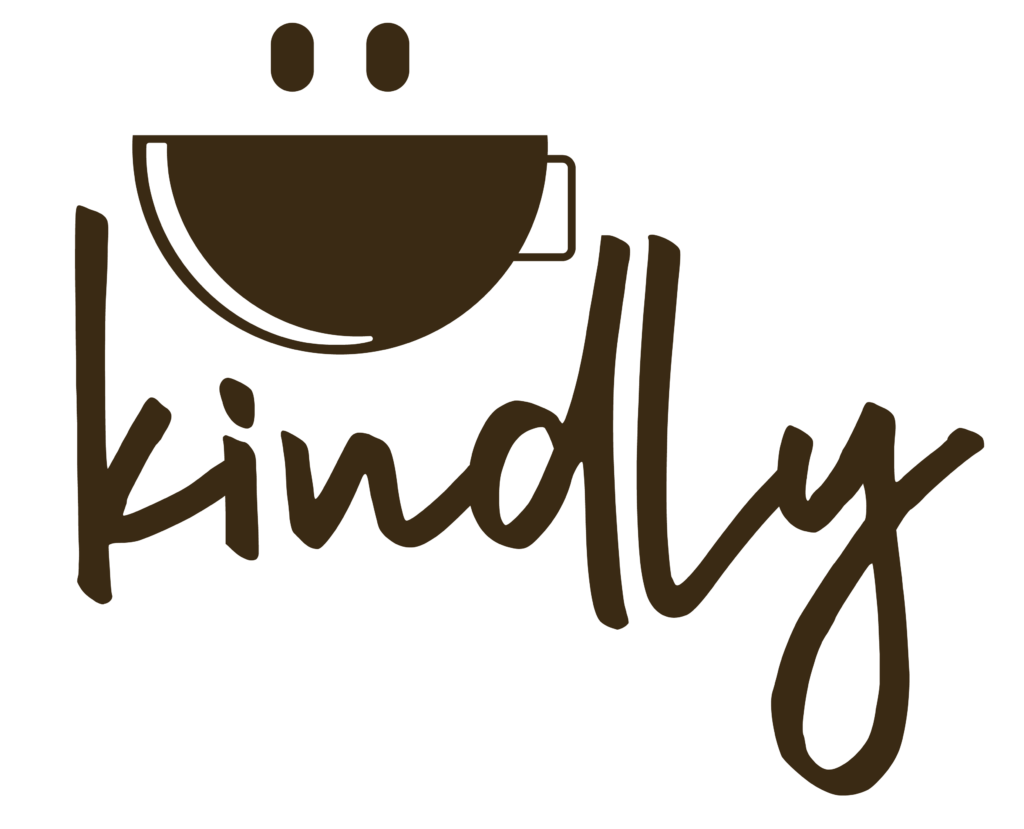
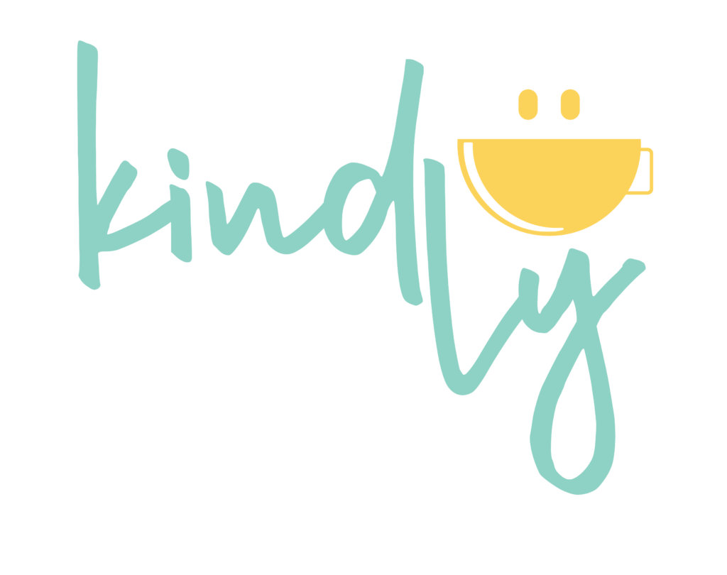
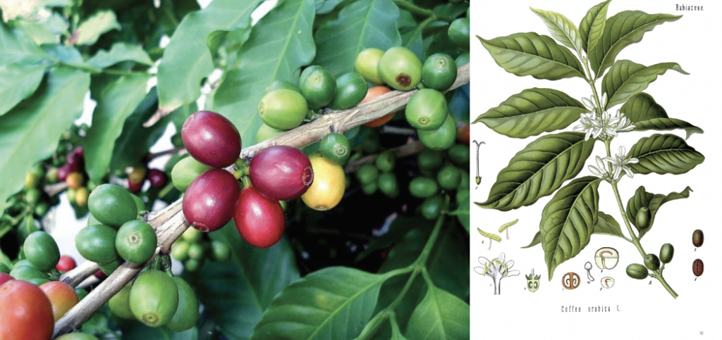
Sarah had mentioned in the brief that she wanted to include a yellow smiley face as the focal point of her brand, but also wanted to include more pastel tones and neutral browns. The colors in the palette you see below and in the brand pattern actually were born from inspiration of images of coffee bean plants. Even the yellow was derived from one of the stages of growth from the coffee bean itself.


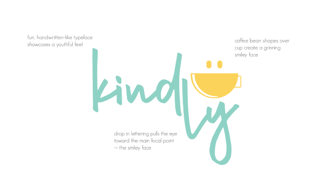
Finally, here’s just a little peak into why I chose certain design elements.
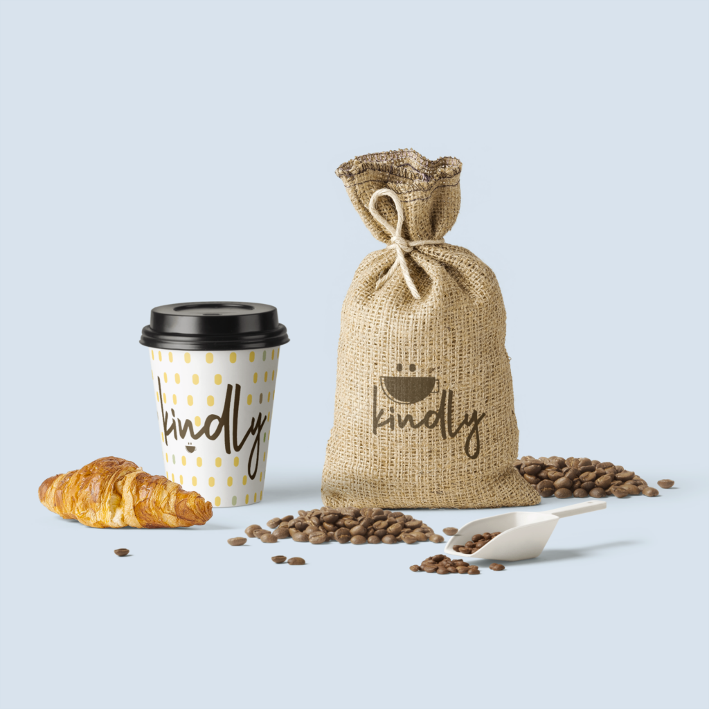
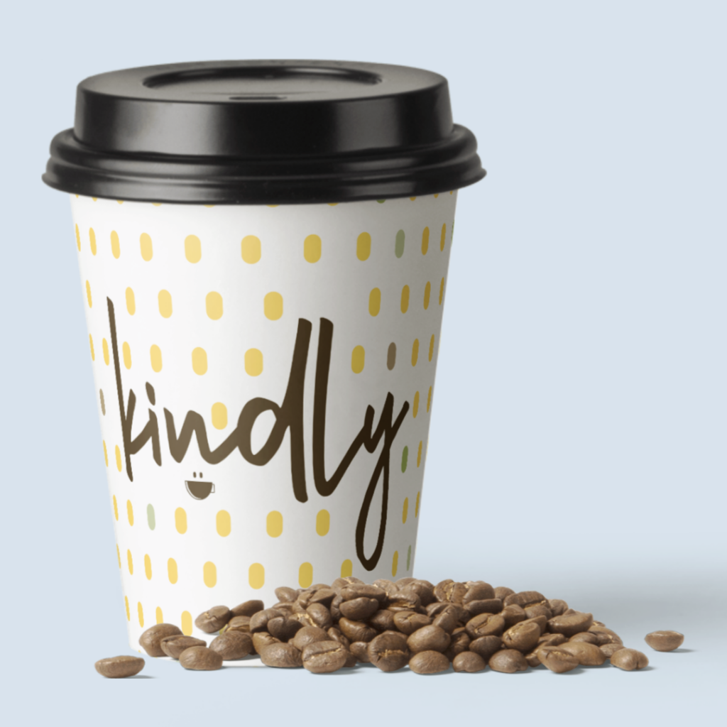
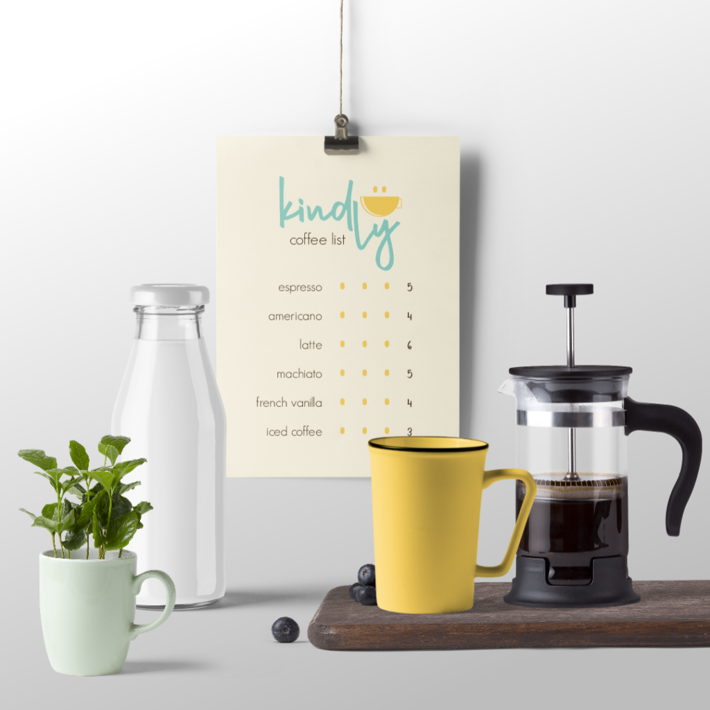
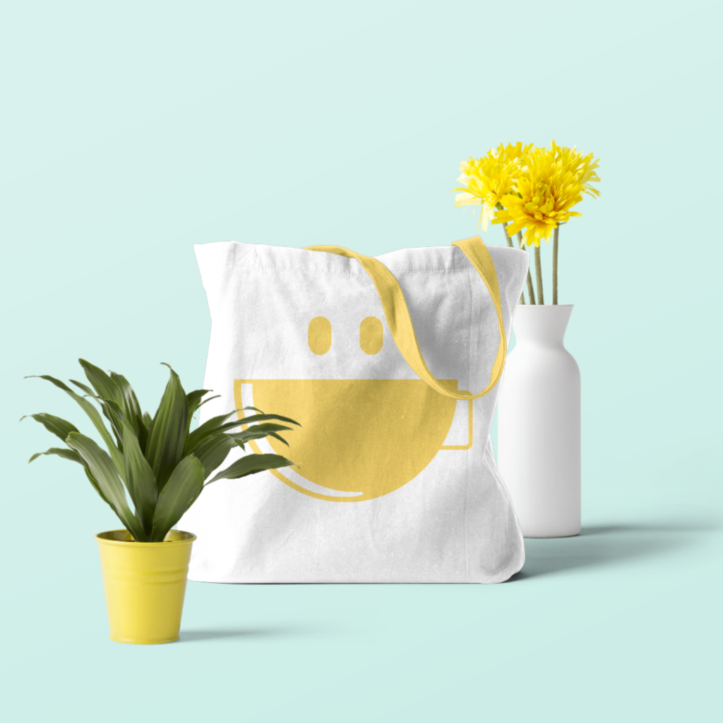
And, because I love them, and they bring such a realness to any prospective brand design — a few more mockups.
Want a brand that’s as shareable as a pretty coffee drink?

