At the moment, I’m working part time and have been working weekends. Yesterday was a slow day at work, and I wanted to come home and stretch my creative muscles. The only problem was that all of the projects I’m currently working on are at a stage where I’m waiting for feedback before I can do anything else. I used to really love my design classes in school and loved that they would just give us a brief and let us run with it, so I started searching the internet for something similar. I found a site called Briefbox.
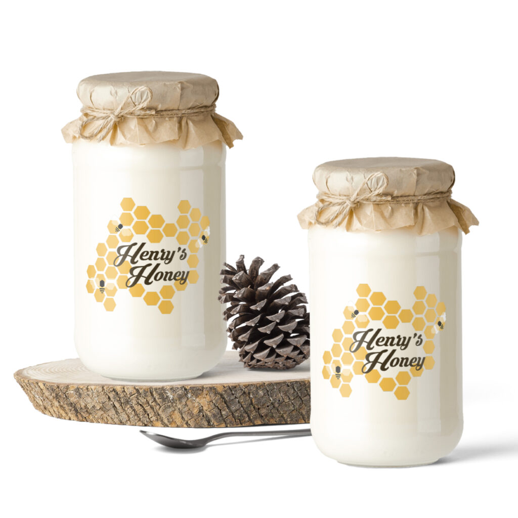
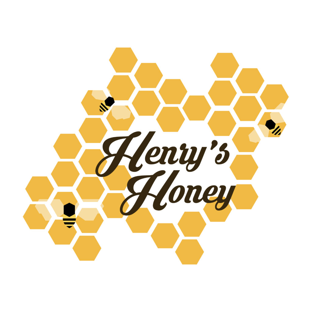
After looking at the briefs I could look at for free, I decided on a honey label for a fictitious company called “Henry’s Honey”. Below is the brief I read:
‘Henry’s Honey’ is a premium British company that pride themselves on producing luxury, organic honey; it’s the best quality stuff on the market today. They are looking for a passionate designer to create a brand new logo and label design that represents the high-end, pure honey that ‘Henry’s’ produce. The design will need to intrigue customers and stand out on the shelf. The client is really keen on keeping the label clean and modern, with a ‘less-is-more’ approach; only include essential elements.
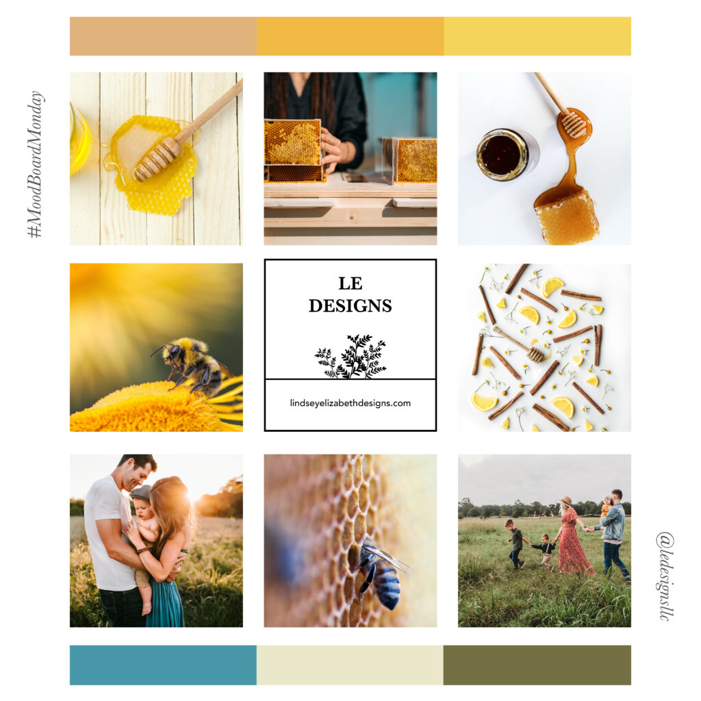
Consider imagery and typography in your design. Maybe create a small illustration of a bee, a hive, or a field to represent the organic nature of the product. Experiment with different techniques in the design stage; try using paints, pens, inks and other materials to help give you a variety of textures and aesthetics to work with.
As this is a brand and label project, you’ll need to initially work on your main brand concept, before getting started with the label artwork. The client hasn’t specified what style of typography or which images you should use, and so you’ll need to experiment with plenty of concepts loosely and then 2 or 3 further; which is feeling best? After you have the brand nailed, start incorporating the brand into a strong, clean and easily digestible label design.
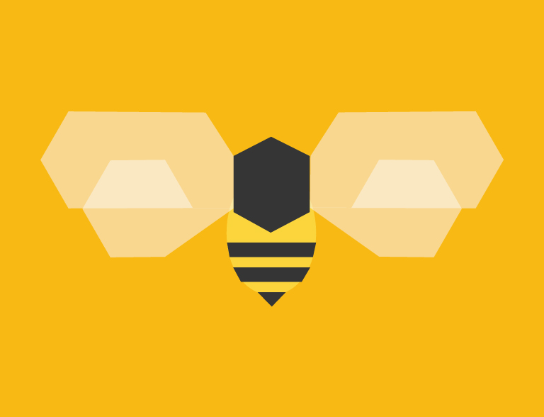
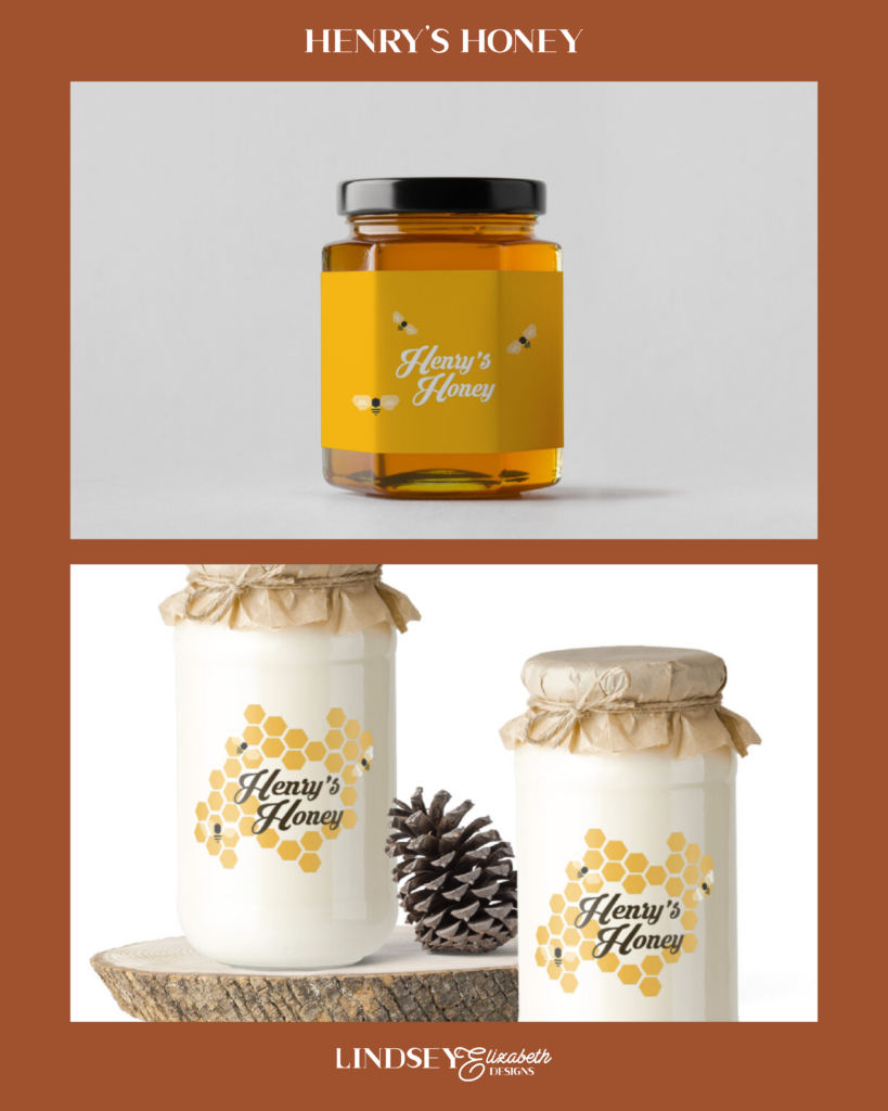
I decided to go with a simple bee design that was cartoonish but not child-like. I paired it with a whimsical font that felt suitable for a honey company and added in some detailing such as shading behind the letters. I wanted to keep a warm yellow color for the label, since the honey is all-natural and would blend in well with the product but stand out enough so you would still be able to read the label.